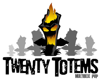
I started by designing a proper logo for the group:

I'm currently working on a new theme for my blog that will match this new look, along with a eePanels skin for WoW, so I can sport my new logo and custom interface in my multibox movies.
The totem you see in the logo is a Totem of Wrath. At the suggestion of a buddy, I'm going to also design 3 friends for him (water air and earth) and use them throughout my interface for the site.
Let me know what you think! (I'm talking to Jon, because he's the only one reading this.) :)
Boom

2 comments:
Generally sweet. Are you going to put all twenty totems in there? Even if they're really faded in the background? I don't know if that would look good or bad...
I'm also not real keen on the font. Doesn't feel like WoW at all. The 'O' in "Multibox" looks good with that font though.
Text layout is good, IMO. And Fire Totem of course rocks. (Or "burns"? Either way, it's good.) Just change up the grass blade silhouette's slightly for a couple of them.
And you should put the other 3 totems mixed in there in the back, once you have them designed.
Come to think of it... I like the font you're using now over the one in the new logo...
Post a Comment